
THE BEER BAR
TAP INTO IT.
Brand identity, custom logo and verbal identity for a Sydney craft beer bar built around 42 rotating taps.
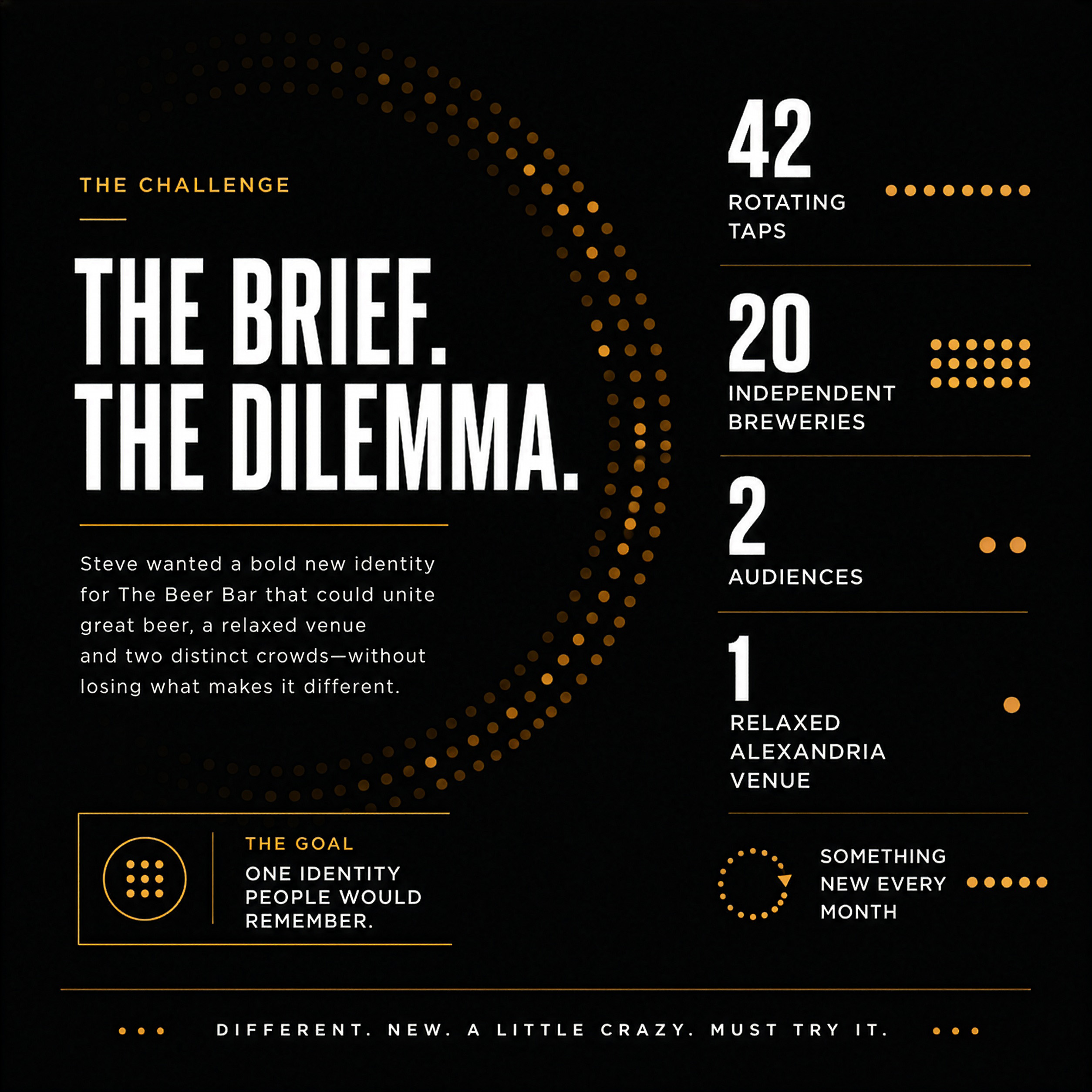
The Beer Bar was conceived as a different kind of Sydney drinking experience: 42 rotating taps, 20 independent breweries and something new every month. 27+S created the brand identity, custom logo and verbal hook to give the idea a clear point of view – modern, confident, welcoming and just a little bit cheeky.
Specialisms
Brand Identity
Custom Logo Design
Verbal Identity + Tagline
Brand Applications
Logo Style Guide
Event Poster Design
Short-run Print Production
THE
CHALLENGE
42 taps. One identity people would remember.
Steve Paull’s idea was to bring keg-fresh beer from independent Australian breweries into one relaxed Alexandria venue. The brand needed to speak to two audiences at once: knowledgeable craft beer drinkers looking for new taste experiences, and locals wanting somewhere easy and enjoyable to meet after work.
The balance mattered. It had to feel modern and upper-market without becoming exclusive; friendly without becoming safe; fun without disappearing into the familiar visual cliches of craft beer. It also needed enough flexibility to move from a tiny website favicon to caps, shirts, glassware, digital promotion and future venue applications.
27+S
APPROACH
Build the identity around the experience.
27+S explored four distinct creative directions, testing each beyond the logo so the client could see how it would behave in the real world. The final direction centred on a custom-designed TBB monogram – a compact mark created to be ownable, highly adaptable and clear at any scale.
A black-and-white palette gave the identity clarity, confidence and practical flexibility. Then came the line that made the idea click: Tap into it. It played directly on the bar’s 42 taps, but also worked as a subtle invitation to discover the beer, the venue and the experience.
RESULTS + IMPACT
HELL YES.
The result was a flexible launch identity that could move from favicon to glassware, signage and digital applications without losing its character.
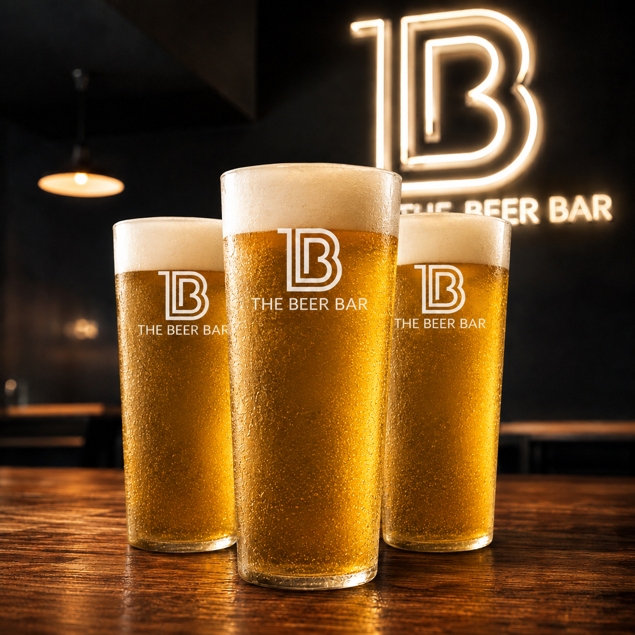
The identity moved into the venue itself, where the client installed the TBB logo as a large illuminated wall feature. The mark became part of the physical experience – not simply something seen on a screen or at the door.
Across the venue, the monogram and Tap into it appeared on glassware and the digital tap displays, carrying the identity through the customer experience and back to the bar’s defining 42-tap idea.
Most importantly, it felt true to the business Steve wanted to create: different, relaxed, confident and a little bit crazy. His reaction to the logo was immediate – and very much in character with the brand.
CLIENT RESPONSE
Steve Paull, Founder, The Beer Bar
“Ha! You’ve got it girl! We both know there’s a ‘fuck yeah!’ in there.”
“Thank you for doing a fantastic job! You have helped bring it alive.”
